Field Notes: observations and explorations of inequity in the built environment, and visions for its future.
02.02.23
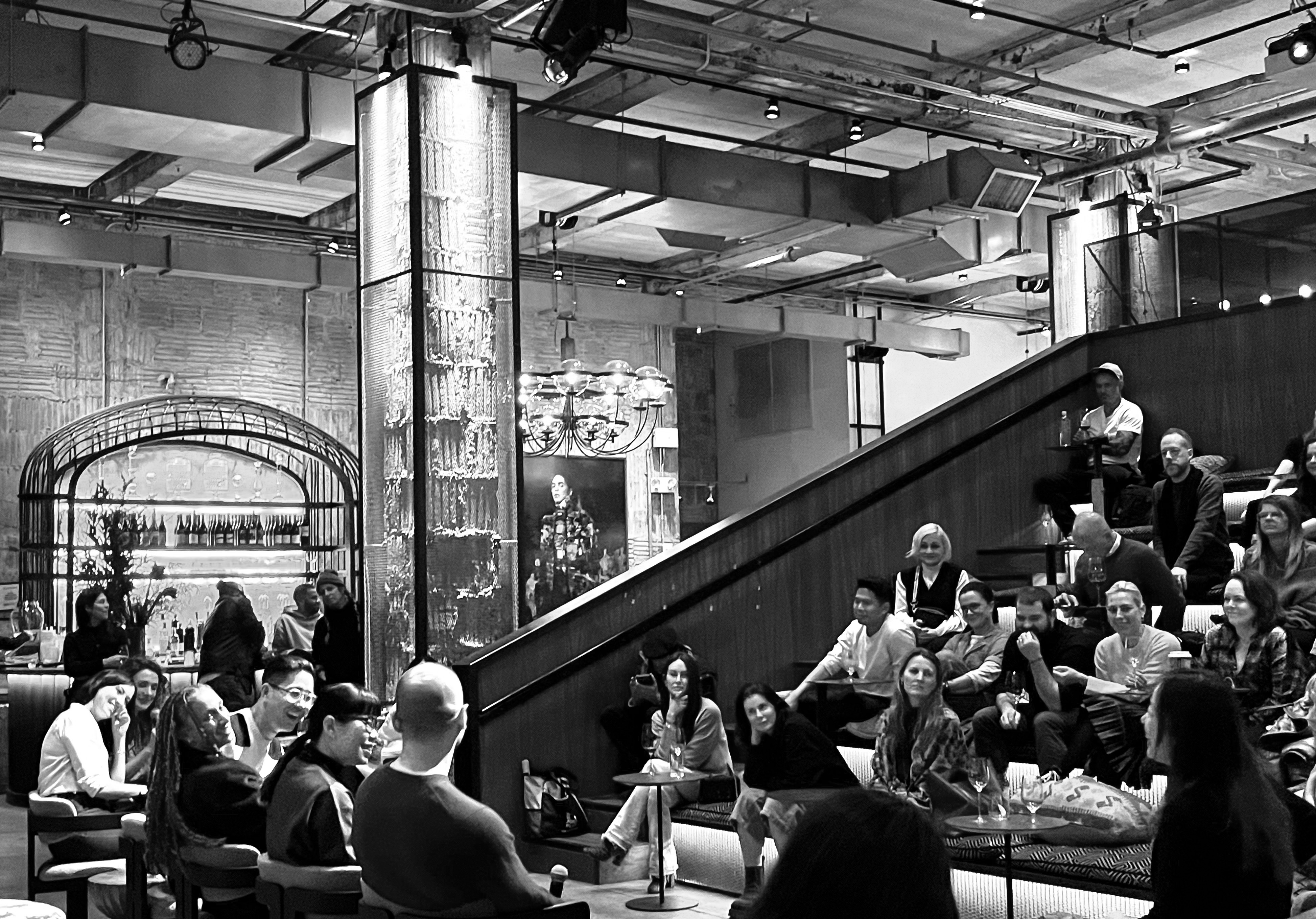
In person event moderated by Le Whit, with guest speakers Michael K. Chen, Founder & Principal of the firm MKCA and Co-Founder of Design Advocates; Jack Balderrama Morley, Managing Editor at Dwell Magazine; Angela Hau, interior and architectural photographer; and Estelle Bailey-Babenzien, Founder of Dream Awake Design Studios and Co-Founder of sustainable clothing brand NOAH.
![]()
In our design practice, we prioritize critical engagement with the built environment not only through the creation of physical spaces, but through the investigation of their social-emotional impacts— both in theory and tangibly.
In our first live-format Field Notes, we invited design industry cohorts whose work and perspectives we admired into conversation to observe and explore the built environment alongside us. Hosted by NeueHouse in NYC, we took a collective look at how, in today’s image-based culture, architecture and design have become increasingly diluted. We have witnessed the proliferation and ubiquity of “the image” as it teeters between a tool used within the industry, to that of over-saturation.
The rise of internet based photo sharing throttles designers into a disheartening and uninspiring closed-loop circuit of image-based inspiration exchange, at times alienating designers from clients who want their spaces to reflect status, or the most clicked trend, while designers remain emotionally disconnected and at the mercy of the fast paced, over shared media economy.
Yet at the same time, the image’s role within our industry is key: many practices depend on it, both for inspiration and sourcing, as well as for marketing finished projects and connecting with new clients.
How present is this sense of alienation? How may it be inhibiting valuable emotional connections between designers and clients, or designers and the public? More pertinently, between designers and their requirement to address the core needs of comfort, care, security, safety, and long term sustainability that design should provide? And how are designers responding to these tensions? How are industry leaders maneuvering the role of the image toward its healthy, productive utility? What is today’s design image saying, doing – or even being?
Together, we unpacked the value of design within and beyond the image, from lots of different angles and with lots of different nuances. Read on for some of the highlights of our conversation.
by Le Whit, in collaboration with Emily R. Pellerin and Nabi Williams
The Image vs. Reality Complex
Unpacking the value of design within and beyond the image.In person event moderated by Le Whit, with guest speakers Michael K. Chen, Founder & Principal of the firm MKCA and Co-Founder of Design Advocates; Jack Balderrama Morley, Managing Editor at Dwell Magazine; Angela Hau, interior and architectural photographer; and Estelle Bailey-Babenzien, Founder of Dream Awake Design Studios and Co-Founder of sustainable clothing brand NOAH.
In our design practice, we prioritize critical engagement with the built environment not only through the creation of physical spaces, but through the investigation of their social-emotional impacts— both in theory and tangibly.
In our first live-format Field Notes, we invited design industry cohorts whose work and perspectives we admired into conversation to observe and explore the built environment alongside us. Hosted by NeueHouse in NYC, we took a collective look at how, in today’s image-based culture, architecture and design have become increasingly diluted. We have witnessed the proliferation and ubiquity of “the image” as it teeters between a tool used within the industry, to that of over-saturation.
The rise of internet based photo sharing throttles designers into a disheartening and uninspiring closed-loop circuit of image-based inspiration exchange, at times alienating designers from clients who want their spaces to reflect status, or the most clicked trend, while designers remain emotionally disconnected and at the mercy of the fast paced, over shared media economy.
Yet at the same time, the image’s role within our industry is key: many practices depend on it, both for inspiration and sourcing, as well as for marketing finished projects and connecting with new clients.
How present is this sense of alienation? How may it be inhibiting valuable emotional connections between designers and clients, or designers and the public? More pertinently, between designers and their requirement to address the core needs of comfort, care, security, safety, and long term sustainability that design should provide? And how are designers responding to these tensions? How are industry leaders maneuvering the role of the image toward its healthy, productive utility? What is today’s design image saying, doing – or even being?
Together, we unpacked the value of design within and beyond the image, from lots of different angles and with lots of different nuances. Read on for some of the highlights of our conversation.
by Le Whit, in collaboration with Emily R. Pellerin and Nabi Williams
Design vs Curated Idealism
The 2D image plays a key role in how design practices gain business. At the same time, design is in fact a 3D sensorial experience, one that an image— no matter how provocative— cannot fully capture. While the image may be a culprit in potential disconnects between clients and creators, we explore how to move beyond its challenges to productively, communally understand its utility.
MKCA:
“We begin our process always about the values of the project – our work must comport with what our client sees as “good” in the world, for it to be beautiful to them. What animates desire, for example? With clients, what animates want? We like to say, let’s set the images aside and return to values. The vast majority of our work comes to us because of press. There’s a vital partnership with image-makers because our work comes from them. We’re conscientious of what’s left out of the image. The values of the work we’re doing may be left out.”
Estelle:“ You strike the balance between form and function. Sometimes what is beautiful isn’t always comforting. People want to be positioning themselves a certain way. We have to put more time into our spaces, maybe we care about the aesthetics a bit more. It’s an interesting rabbit hole of perception versus reality, and what that means in design [post-pandemic]. Before, no one needed mud rooms! And now, we see all these authentic design solutions that simplify our lives.”
Liza:“Who is design for? The access to imagery of design has likely shifted exposure to design in many senses. And how does that affect expectations of design, whether that’s from the public or from clients? People are sick of the perfection of images.”
Corey: “During COVID especially, your life was so acutely represented in 2D form. We were operating socially and professionally from the screen. And we work in 3D space, so there was a particular challenge to our field.”
The Problematic Sway of the Image
Though design is something that needs to be fully experienced with all senses, images are still a necessary tool for communicating work with clients and the general public— be it through renderings and process images, or finished projects within the glossy pages of a magazine. Here, we explore how the image can be a double-edged sword.
Estelle:
“Clients love the feeling and attention to specific detail - the ‘hand touch’ - even though my hand renders suck! Hand or human touch [can be] the difference between a photograph and a rendered space. Sometimes the image is not conducive to design. But at the same time I love the inspirational art image, too. But with a certain amount of flaws. How, as a designer, do we create certain spaces to hide the mess? How can we create peace of mind for a client that way?”
Angela:“ I get to enjoy the fruit of everybody’s labor. I get to document it. It’s fun for me – I’m often the first one to see the end result. Where I come in, I get to take the spaces, and choose where I put my camera, choose exposure time, choose the postproduction [decisions]. Some images can look completely sterile – it’s up to the photographer to come in with their own touch.”
Jack:“Now is an interesting time for design media images – we’re awash in images; People are hungry for another layer of information from the images. They want inspiration, how it’s built, greater or multiple narratives. Ideally the photographer is given something from an editor to work with. But the photographer can go in and find or highlight the narrative, to pull something out that shifts the perspective or focus. People want real images, real stories, real spaces, real people. Architects want that crisp, symmetrical space. So as an editor, you’re like ‘no’! People want to see the images where someone has kicked off their shoes. I trained as an architect. I have sympathy! But as an editor I respect and admire what everyone is doing to get to that final point of the image.”
Liza:“To have your photographer come in and literally frame your work helps remind us about the beauty of a project that we’re really in the trenches on, and, by the point of completion, likely have our own neuroses about.”
MKCA:
“We collect references , we use images as a form. The point at which to introduce renderings is a fraught decision! But when done well they add efficiency to a process. It can become a confrontation with what clients see in their mind. It becomes powerful [to visualize it].”
Corey: [in response to Michael] “Renders nowadays can be used to convince people of the power of design, but it can at times seem utopian. We question if they’re actually as powerful as they seem.”
12.11.2020
Original copy published in PIN-UP.
![]()
New metal umbrellas, and concrete benches as part of Andrew Cuomo’s $100 million dollar expansion project completed in 2016. Photo by Corey Kingston.
![]()
Intentionally low bridges design by Robert Moses and built in 1929 were used to reduce access by city buses, and certain demographics. Photo by Chris Mottalini.
![]()
New concrete leisure activities built as part of Andrew Cuomo’s $100 million dollar expansion project completed in 2016. Photo by Corey Kingston.
Low Life
Revisiting Robert Moses’s Exclusionary Design Scheme at Jones BeachOriginal copy published in PIN-UP.

New metal umbrellas, and concrete benches as part of Andrew Cuomo’s $100 million dollar expansion project completed in 2016. Photo by Corey Kingston.

Intentionally low bridges design by Robert Moses and built in 1929 were used to reduce access by city buses, and certain demographics. Photo by Chris Mottalini.

New concrete leisure activities built as part of Andrew Cuomo’s $100 million dollar expansion project completed in 2016. Photo by Corey Kingston.
The design of Jones Beach State Park was helmed by New York “master builder” Robert Moses. The project, completed in 1929, appropriated funds from the New York State Legislature to build what set out to be, essentially, a “whites only” public beach.
Moses harnessed the power of design to keep Jones Beach segregated. Using his position as the Chairman of the Long Island State Park Commission, he demanded that bridges along the parkways that led to Jones Beach be built unusually low. A municipal bus is typically nine feet, eleven inches, but many of the parkways’ bridges are just nine feet tall — a few are under. These low bridges were not an oversight, but rather a concrete example of Moses’s racist agenda. The bridges barred public buses from accessing the beachfronts, making Jones Beach only reachable by car — an ownership demographic that unsurprisingly skewed largely white middle- and upper-class. Moses’s parkways were touted as a celebration of the booming automotive age; the necessity of a car was seen as a symbol of American exceptionalism rather than a tool for its segregationist agenda.
“The question of access has to be thought about both as the journey to, and the experience at, a place,” says Kelsey Edelen, a Philadelphia-based urban space strategist. “Only looking at one part of this equation can often obscure its true lack of inclusion.” The exclusionary infrastructural model of access to Jones Beach is a stark relative to the “Whites Only” signage of the Jim Crow South; it represents, in the form of its own set of signals, a more insidious and more permanent racism. The Long Island bridges design is of course merely one example of how architecture has upheld, and continues to uphold, the segregation of public spaces — specifically spaces of leisure.
New York-based architect, writer and researcher Alicia Olushola Ajayi argues that “there is an implicit bias in the use of ‘public space’” because there are so few examples of it “that are conceptualized with meeting the needs of the general public.” She goes on to question the meaning of “general public” in the first place. “Perhaps more accurately, (is it) the prioritized public? Or do we just mean ‘whiteness?’ Maybe we need to come clean, that when we say ‘public space’ in the urban environment it is really intended and designed for a select few.”
The case study of Jones Beach supports Ajayi’s assertion: public spaces are built for specific populations to engage with specific types of recreation. It also reveals the American shibboleth that leisure is for white people.
In her 2016 TED Talk, cultural theorist Dr. Brittney Cooper breaks down how time (like race, and like the fallacy of truly public space) is in essence a white construct. She argues that "the racial struggles we are experiencing are clashes over time and space.” When we apply this theory to the concept of leisure, we see, then, that white people retain the power to say when and where and for how long people of color can recreate, relax, or simply rest. The constructed segregation of spaces of leisure perpetuates this. “I think about this a lot,” reflects Ajayi, “and how (NYC’s) Open Streets has unfolded as these magical street festival atmospheres in whiter and richer neighborhoods in the space of quarantine life, which have been supported by the City. It reinforces that leisure is a white thing.”
In spaces like Jones Beach, or New York City’s streets-during-pandemic, the psychological impact of one person’s designed experience of leisure is fostered and upheld to the neglect (if not expense) of another’s. Edelen cites how tangible design decisions affect “the mental and psychic effort of experience,” requiring “designers and planners to focus on the holistic process of using a space.” The necessary concern is beyond physical engagement — it’s emotional, embodied, lived and human. Critically engaging with the provenance of our public spaces and spaces of leisure — in this case the ones infrastructurally and architecturally prescribed to us — arms us, as designers, with a more informed jumping off point and greater liability for our own contributions to the built environment to be anti-racist, ably inclusive, and anti-segregationist.
Our research prepared us for the exclusionary infrastructure of the parkway, but during a recent visit to the state park, what struck us was the overt racial politics of the park’s leisure activities. We were immediately met with the excessiveness of “leisure” as a program. Boardwalk signage boasted that, in 2016, New York Governor Andrew Cuomo invested $100 million dollars into the revitalization of the State Park, concretizing it as a monument to leisure rooted in white pastimes: we witnessed a new and sprawling zip line course (the commodification of which has been led by Western tourists), permanent modifications built into the asphalt for the game corn hole, and expansive shuffleboard courts (not to mention the Dave Matthews Band-funded fountain park). We quite easily “followed the money” along the boardwalk, making note of how these fiscally prioritized spaces were promoting leisure, of what kind, and for which implied users.
Our internal goal, and our outward prompt, is for each of us to create from the space of challenged perceptions. American architecture has built and upheld pillars of racism in every corner of this country. As we look to removing statues of white supremacists, we must also harness the power of design to attend to the faceless monuments of infrastructure. Though banal, they are hardly benign.
by Le Whit, in collaboration with Emily R. Pellerin
08.20.2020
![]()
Original Border Wall in Nogales, Arizona. Photo by Corey Kingston.
Burial Meets Border
Impacts of the expedited border wall construction on the Tohono O’odham nation’s ritual and burial sites.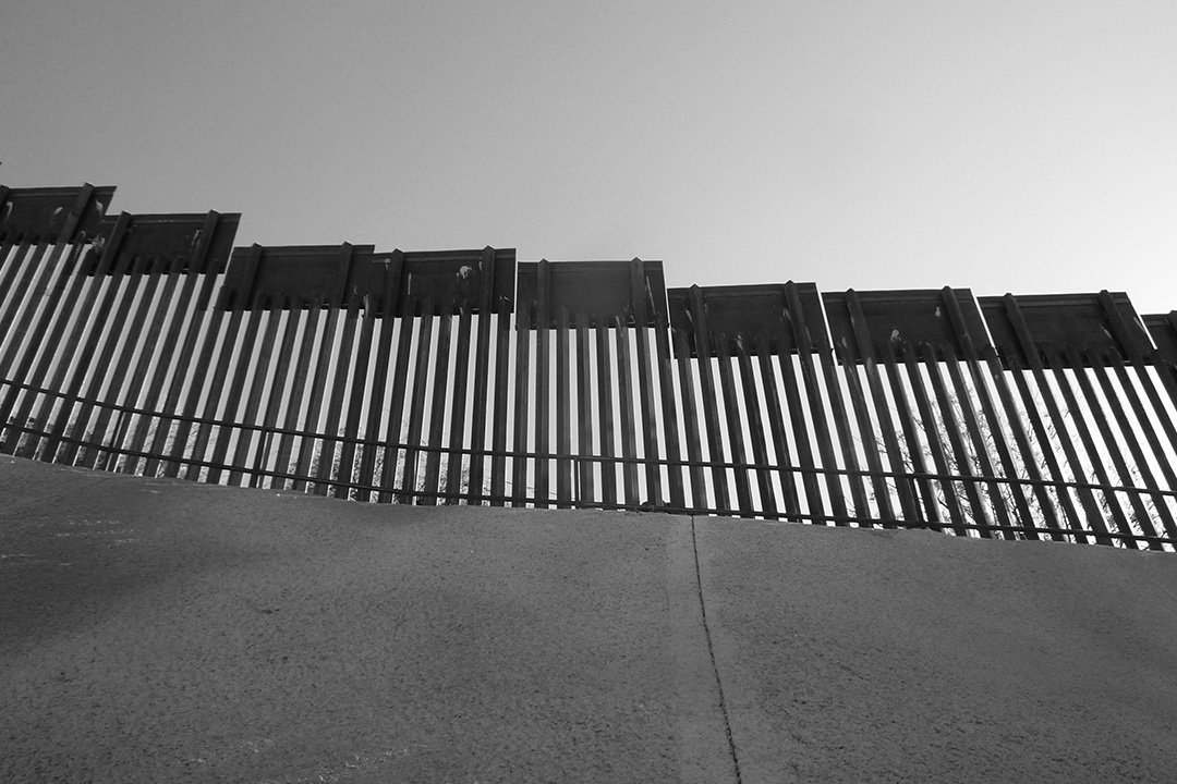
Original Border Wall in Nogales, Arizona. Photo by Corey Kingston.
For hundreds of years, the Tohono O’odham Nation had moved freely across its tribal land, which spans southern Arizona and northern Mexico. After the 9/11 terrorist attack in New York City, a preliminary border wall was erected, severing it in half. Only through designated points of “crossing” could the Nation retain its ability to visit family and its sacred sites, to access healthcare, and to receive education.
This passage has been disrupted once again with this year’s expedited construction of Donald Trump’s border wall. Federal courts have waived many restrictions put in place to protect the Tohono O’odham Nation and neighboring Organ Pipe Cactus National Monument, allowing unmitigated blading and demolition of archaeological (ritual and burial) sites and publicly protected park lands—equating to the demolition and disregard of Tohono O’odham culture.
Physical walls have consequences. Regarding the border wall as a design choice both symbolic and literal allows (rather, requires) us to consider the larger systems behind design and its impacts—as well as who they are uniting or dividing, serving or harming.
In March, the New York Times reported from within the Nation: “Tell me where your grandparents are buried and let me dynamite their graves,” said Verlon M. José, governor of the Mexico-based Tohono O’odham. “This wall is already putting a scar across our heart.”
The border wall as a physical piece of architecture has had, and will continue to have incredible repercussions on the everyday life of the Tohono O’odham people, their sacred land, and tribal rituals.
Special thanks to the 2016 reporting of Caitlin Blanchfield and Nina Valerie Kolowratnik for The Architectural League of New York.
by Le Whit, in collaboration with Emily R. Pellerin
07.15.2020
This Field Notes spurred a commissioned op-ed for ARCHITECT Magazine. Read more here: ‘I Installed the Philip Johnson Sign at MoMA'.
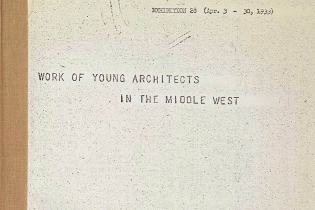
![]() Exhibition Catalogue, Museum of Modern Art
Exhibition Catalogue, Museum of Modern Art
Curatorial Supremacy
Philip Johnson’s Tenure at the Museum of Modern Art and its implication for American’s architecture of discriminationThis Field Notes spurred a commissioned op-ed for ARCHITECT Magazine. Read more here: ‘I Installed the Philip Johnson Sign at MoMA'.
 Exhibition Catalogue, Museum of Modern Art
A publication for Philip Johnson’s 1933 exhibition “Young Architects of the Middle West.” The exhibition was developed during Johnson’s tenure as head of Architecture and Design at The Museum of Modern Art.
Johnson, a known Fascist and Nazi sympathizer, selected a group of white male architects to submit their designs of pre-fabricated homes and housing projects. For Johnson, architecture was a conduit for enrichment, for industry, and for perpetuating his white world view and political ideals. It was not intended for social good.
The architects selected for the exhibition were chosen by Johnson for their compliance in upholding the “traditions” of modern architecture. They were not selected for their social empathy or expertise in public policy. Their designs did not aim to relieve the housing crisis of the Depression era. Instead, the designs were lauded for their aesthetics, not for their welfare.
Exclusionary curation is a bedrock of our educational and cultural institutions. And this bedrock is what we’ve built our country on. It is inescapable.
Philip Johnson’s legacy was best described by Nikil Saval who wrote for New Yorker Magazine that, “more than any of his contemporaries, [Johnson] was able to influence the scope and direction of the American built environment. We still live in the shadow of the architecture that Johnson brought into being.”
by Le Whit, in collaboration with Emily R. Pellerin